Pantone Color of the Year 2026: Creating Calm, Dignified Supportive Living with Cloud Dancer
Why colour matters in supportive living
Design choices in supportive living are not simply aesthetic. They influence how residents experience safety, dignity, and comfort in their day-to-day lives. Increasingly, UK policy and research recognise that the built environment plays a meaningful role in health and well-being, particularly for older residents and individuals with additional support needs.
Pantone’s annual Colour of the Year selection is often used to reflect wider cultural and design priorities. According to Pantone’s official Colour of the Year programme, colour trends are shaped by social, economic, and emotional conditions. For 2026, Pantone selected Cloud Dancer, a soft neutral intended to convey calm, simplicity, and clarity.
For supportive living providers and property investors, this raises a practical question. How can design choices such as colour support dignified living while remaining operationally sensible and regulation-aware.
Understanding Cloud Dancer in a supportive living context
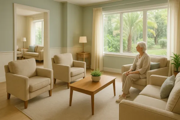
Cloud Dancer is not a stark or clinical white. It is a softened neutral designed to reduce visual noise and support a sense of openness. In supportive living environments, strong contrasts or saturated colours can contribute to discomfort or disorientation, particularly for residents with cognitive or sensory sensitivities.
UK policy increasingly links housing conditions to health outcomes. The UK government’s Health disparities and health inequalities: applying All Our Health guidance highlights that living conditions, including housing quality, are significant determinants of both physical and mental well-being. Within this context, lighter neutral tones can help create spaces that feel familiar and reassuring while still allowing for appropriate contrast through furniture, flooring, and signage.
This balance is especially important in supportive living, where environments must feel homely without compromising safety or accessibility.
Why calm design supports dignity and wellbeing
Supportive living is fundamentally about enabling independence while providing appropriate levels of care and oversight. Design decisions should reinforce that principle.
Calm colour palettes can help reduce overstimulation and anxiety, particularly in communal areas such as lounges, corridors, and dining spaces. They also support clearer wayfinding when paired with compliant contrast levels. The Design Council’s “Principles of Inclusive Design” explains how inclusive environments reduce barriers and support people with a wide range of physical and cognitive needs.
From an operational perspective, neutral palettes can also support long-term asset management. Highly trend-led colours may date quickly, whereas softer tones allow providers to refresh schemes incrementally rather than relying on frequent, disruptive refurbishments. For investors, this can support more predictable maintenance planning and lifecycle costs.
Practical considerations for providers and investors
While colour trends can offer useful insight, they should always be applied pragmatically. Providers and investors may wish to consider:
How colour choices interact with natural and artificial lighting, particularly in schemes designed to meet accessibility standards
Whether finishes support durability, ease of maintenance, and long-term cost control
How design decisions align with resident needs, including dementia-friendly design principles
The relationship between aesthetic choices and regulatory compliance
Design decisions also sit alongside wider policy considerations. Energy efficiency requirements continue to influence lighting strategies, materials, and refurbishment decisions. UK government guidance in A guide to Energy Performance Certificates for the marketing, sale and let of dwellings remains a key reference point for anyone operating or investing in residential property.
Linking design trends to wider policy and regulation
Supportive living providers operate within a complex regulatory environment. While colour selection itself is not regulated, refurbishment and design choices can affect compliance, funding structures, and long-term scheme viability.
As government policy continues to focus on housing quality, sustainability, and health outcomes, investors and providers need to consider how design decisions align with planning requirements, EPC targets, and supported housing standards. Taking a holistic view helps ensure schemes remain fit for purpose in both social and financial terms.
Pantone’s Colour of the Year 2026 reflects a broader shift toward calm, clarity, and dignity. In supportive living, these themes align closely with the sector’s core objectives. When applied thoughtfully, design choices such as Cloud Dancer can support resident wellbeing, reinforce a sense of home, and contribute to sustainable, compliant schemes.
At SHPC, the focus remains on understanding how design influences intersect with regulation, operational realities, and long-term investment strategy.
👉 Want to understand how design decisions, regulatory requirements, and long-term asset planning intersect in supportive living? Connect with Shannon Hoang at SHPC to explore how we help investors and providers navigate these considerations with clarity and confidence.
⚠️ Disclaimer: This article is for general information only and should not be relied upon as legal, financial, or investment advice. Property investments carry risks, and energy efficiency requirements remain subject to consultation and change. Please seek professional advice tailored to your circumstances.
